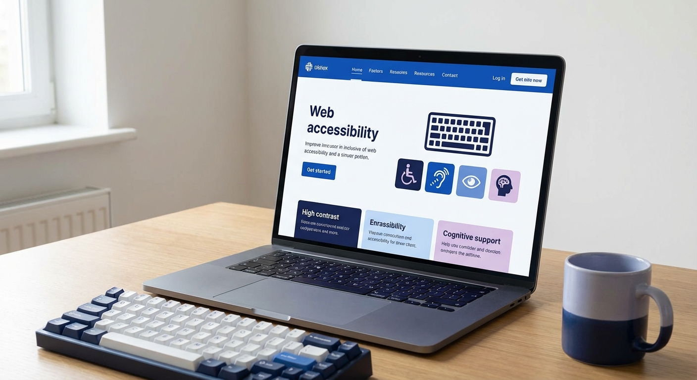
웹 접근성(Web Accessibility)은 장애가 있는 사용자를 포함한 모든 사람이 웹사이트를 이용할 수 있도록 보장하는 것입니다. 단순한 법적 의무를 넘어, 더 넓은 시장 접근과 SEO 개선, 사용자 경험 향상으로 이어지는 중요한 비즈니스 전략입니다.
웹 접근성이란 무엇이고 왜 중요한가
전세계 인구의 약 15%(10억 명 이상)가 어떤 형태로든 장애를 겪고 있습니다. 한국에서는 등록 장애인이 약 265만 명(2024년 기준)이며, 이는 전체 인구의 5.1%에 해당합니다.
장애의 범주는 생각보다 넓습니다:
- 영구적 장애: 시각/청각/신체 장애
- 일시적 장애: 팔 부상, 눈 수술 후 회복기
- 상황적 장애: 밝은 햇빛 아래에서 화면 보기, 시끄러운 환경에서 동영상 시청, 한 손으로 스마트폰 조작
How semantic HTML maps to accessibility roles for assistive technology
법적 의무와 비즈니스 가치
한국의 법적 요구사항
장애인차별금지 및 권리구제 등에 관한 법률 (2008년 시행):
- 공공기관: 2009년부터 의무 (과태료 최대 3천만원)
- 국가/지방자치단체: 웹 접근성 품질인증 마크 필수
- 민간기업: 법적 의무는 아니지만, 장애인 차별 소송 가능
- 의료기관/대학: 정보접근성 의무 강화 추세
⚠️ 법적 리스크
2023년 한국 법원에서 시각장애인이 은행 웹사이트 접근 불가로 소송을 제기하여 승소한 사례가 있습니다. 웹 접근성 미준수는 차별 행위로 간주될 수 있습니다.
비즈니스 가치
- 시장 확대: 265만 장애인 + 고령자 시장 접근
- SEO 향상: 의미론적 HTML과 명확한 구조는 검색엔진 최적화에 직접 기여
- 사용성 개선: 접근 가능한 UI는 모든 사용자에게 더 나은 경험 제공
- 법적 리스크 회피: 소송 및 과태료 방지
- 브랜드 이미지: 사회적 책임을 다하는 기업 이미지
WCAG 2.1 핵심 원칙 (POUR)
WCAG (Web Content Accessibility Guidelines) 2.1은 4가지 핵심 원칙을 제시합니다.
1. Perceivable (인식 가능)
정보와 UI 컴포넌트는 사용자가 인식할 수 있어야 합니다.
핵심 성공 기준:
- 1.1.1 비텍스트 콘텐츠: 모든 이미지에 대체 텍스트 제공
- 1.3.1 정보와 관계: 명확한 제목 구조, 레이블, 관계
- 1.4.3 명암 대비: 텍스트 대비 최소 4.5:1 (AA 기준)
- 1.4.11 비텍스트 명암 대비: UI 컴포넌트 대비 최소 3:1
2. Operable (운용 가능)
UI 컴포넌트와 내비게이션은 운용 가능해야 합니다.
핵심 성공 기준:
- 2.1.1 키보드 접근: 모든 기능을 키보드로 조작 가능
- 2.4.1 블록 건너뛰기: Skip navigation 링크 제공
- 2.4.3 포커스 순서: 논리적인 Tab 순서
- 2.4.7 포커스 표시: 명확한 포커스 인디케이터
3. Understandable (이해 가능)
정보와 UI의 작동은 이해 가능해야 합니다.
핵심 성공 기준:
- 3.1.1 페이지 언어:
- 3.2.1 포커스 시: 포커스만으로 컨텍스트 변경 없음
- 3.3.1 오류 식별: 입력 오류 명확히 안내
- 3.3.2 레이블/지시: 입력 필드에 명확한 레이블
4. Robust (견고함)
콘텐츠는 다양한 사용자 에이전트(보조 기술 포함)로 해석 가능해야 합니다.
핵심 성공 기준:
- 4.1.1 구문 분석: 유효한 HTML 작성
- 4.1.2 이름, 역할, 값: 모든 UI 컴포넌트에 명확한 역할과 상태 제공
- 4.1.3 상태 메시지: 스크린 리더가 인식할 수 있는 동적 콘텐츠 업데이트
Semantic HTML의 힘
의미론적 HTML은 접근성의 기초입니다. 올바른 HTML 요소를 사용하면 보조 기술이 콘텐츠를 정확히 해석할 수 있습니다.
Landmark Roles
html
<!-- 나쁜 예: 모든 것이 div -->
<div class="header">
  <div class="nav">...</div>
</div>
<div class="content">...</div>
<div class="footer">...</div>

<!-- 좋은 예: Semantic HTML -->
<header>
  <nav>...</nav>
</header>
<main>
  <article>
    <h1>제목</h1>
    <section>...</section>
  </article>
</main>
<aside>
  <h2>관련 정보</h2>
</aside>
<footer>...</footer>
스크린 리더는 landmark를 인식하여 사용자가 빠르게 원하는 섹션으로 이동할 수 있게 합니다.
Heading Hierarchy
html
<!-- 나쁜 예: 건너뛴 헤딩 레벨 -->
<h1>메인 제목</h1>
<h3>섹션 제목</h3>  <!-- h2를 건너뜀 -->

<!-- 좋은 예: 논리적 구조 -->
<h1>메인 제목</h1>
<h2>섹션 제목</h2>
<h3>하위 섹션</h3>
<h2>다음 섹션</h2>
💡 헤딩 레벨 검증
Chrome DevTools > Accessibility 탭에서 헤딩 구조를 시각화할 수 있습니다. 논리적 계층 구조를 유지하는 것이 중요합니다.
ARIA 속성 실전 적용
ARIA (Accessible Rich Internet Applications)는 HTML이 표현하지 못하는 의미를 보조 기술에 전달합니다.
기본 원칙: ARIA는 최후의 수단입니다. 먼저 Semantic HTML을 사용하세요.
접근 가능한 모달 구현
tsx
'use client';
import { useEffect, useRef } from 'react';

export function AccessibleModal({
  isOpen,
  onClose,
  title,
  children
}: {
  isOpen: boolean;
  onClose: () => void;
  title: string;
  children: React.ReactNode;
}) {
  const modalRef = useRef<HTMLDivElement>(null);
  const previousFocusRef = useRef<HTMLElement | null>(null);

  useEffect(() => {
    if (isOpen) {
      // 현재 포커스 요소 저장
      previousFocusRef.current = document.activeElement as HTMLElement;

      // 모달로 포커스 이동
      modalRef.current?.focus();

      // 바깥 스크롤 방지
      document.body.style.overflow = 'hidden';
    } else {
      // 모달 닫힐 때 이전 포커스 복원
      previousFocusRef.current?.focus();
      document.body.style.overflow = '';
    }

    return () => {
      document.body.style.overflow = '';
    };
  }, [isOpen]);

  if (!isOpen) return null;

  return (
    <div
      className="fixed inset-0 z-50 flex items-center justify-center bg-black/50"
      onClick={onClose}
      role="dialog"
      aria-modal="true"
      aria-labelledby="modal-title"
    >
      <div
        ref={modalRef}
        className="bg-white rounded-lg p-6 max-w-md w-full"
        onClick={(e) => e.stopPropagation()}
        tabIndex={-1}
      >
        <div className="flex justify-between items-start mb-4">
          <h2 id="modal-title" className="text-xl font-bold">
            {title}
          </h2>
          <button
            onClick={onClose}
            aria-label="모달 닫기"
            className="text-gray-500 hover:text-gray-700"
          >
            <svg className="w-6 h-6" fill="none" stroke="currentColor" viewBox="0 0 24 24">
              <path strokeLinecap="round" strokeLinejoin="round" strokeWidth={2} d="M6 18L18 6M6 6l12 12" />
            </svg>
          </button>
        </div>
        <div>{children}</div>
      </div>
    </div>
  );
}
주요 접근성 기능:
role="dialog", aria-modal="true": 스크린 리더에 모달임을 알림aria-labelledby: 모달 제목과 연결- 포커스 트랩: 모달 내부에서만 Tab 이동
- 포커스 복원: 모달 닫힐 때 이전 포커스 위치로 복귀
- ESC 키로 닫기 (추가 구현 권장)
ARIA Live Regions
동적으로 업데이트되는 콘텐츠를 스크린 리더에 알립니다.
tsx
export function FormStatus({ message, type }: { message: string; type: 'success' | 'error' }) {
  return (
    <div
      role="status"
      aria-live="polite"
      aria-atomic="true"
      className={`p-4 rounded-md ${
        type === 'success' ? 'bg-green-50 text-green-800' : 'bg-red-50 text-red-800'
      }`}
    >
      {message}
    </div>
  );
}
aria-live="polite": 사용자 작업 후 알림 (긴급하지 않음)aria-live="assertive": 즉시 알림 (오류, 경고)aria-atomic="true": 전체 내용을 읽음 (일부만 변경되어도)
색상 대비와 시각적 접근성
WCAG 대비 기준
| 레벨 | 일반 텍스트 | 큰 텍스트 (18px+) |
|---|
| AA | 4.5:1 | 3:1 |
| AAA | 7:1 | 4.5:1 |
큰 텍스트 기준: 18px 이상 또는 14px bold 이상
대비 검사 도구
typescript
// 간단한 대비비 계산 함수
function getContrastRatio(color1: string, color2: string): number {
  const l1 = getLuminance(color1);
  const l2 = getLuminance(color2);

  const lighter = Math.max(l1, l2);
  const darker = Math.min(l1, l2);

  return (lighter + 0.05) / (darker + 0.05);
}

// Chrome DevTools > Inspect > Accessibility에서도 확인 가능
✅ 색상 접근성 체크리스트
[ ] 텍스트-배경 대비비 4.5:1 이상[ ] UI 컴포넌트(버튼, 입력 필드) 테두리 대비비 3:1 이상[ ] 색상만으로 정보 전달하지 않기 (아이콘, 텍스트 라벨 병행)[ ] 포커스 인디케이터 명확히 표시
Focus Indicator
css
/* 기본 outline 제거하지 말 것! */
button:focus {
  outline: 2px solid #4a90d9;
  outline-offset: 2px;
}

/* 더 나은 커스텀 포커스 스타일 */
button:focus-visible {
  outline: 2px solid #4a90d9;
  outline-offset: 2px;
  box-shadow: 0 0 0 4px rgba(74, 144, 217, 0.2);
}
:focus-visible는 키보드 포커스에만 스타일을 적용합니다 (마우스 클릭 시에는 적용 안됨).
키보드 네비게이션
모든 인터랙티브 요소는 키보드로 접근하고 조작할 수 있어야 합니다.
Skip Navigation
tsx
// components/layout/SkipNav.tsx
export function SkipNav() {
  return (
    <a
      href="#main-content"
      className="sr-only focus:not-sr-only focus:absolute focus:top-4 focus:left-4
                 bg-accent text-white px-4 py-2 rounded-md z-50"
    >
      본문으로 건너뛰기
    </a>
  );
}

// app/[locale]/layout.tsx
<body>
  <SkipNav />
  <Header />
  <main id="main-content">
    {children}
  </main>
</body>
sr-only 클래스는 시각적으로 숨기지만 스크린 리더는 읽을 수 있습니다.
Focus Trap (모달, 드롭다운)
tsx
// 간단한 포커스 트랩 구현
useEffect(() => {
  if (!isOpen) return;

  const modal = modalRef.current;
  if (!modal) return;

  const focusableElements = modal.querySelectorAll(
    'button, [href], input, select, textarea, [tabindex]:not([tabindex="-1"])'
  );

  const firstElement = focusableElements[0] as HTMLElement;
  const lastElement = focusableElements[focusableElements.length - 1] as HTMLElement;

  const handleTab = (e: KeyboardEvent) => {
    if (e.key !== 'Tab') return;

    if (e.shiftKey) {
      if (document.activeElement === firstElement) {
        e.preventDefault();
        lastElement.focus();
      }
    } else {
      if (document.activeElement === lastElement) {
        e.preventDefault();
        firstElement.focus();
      }
    }
  };

  modal.addEventListener('keydown', handleTab);
  return () => modal.removeEventListener('keydown', handleTab);
}, [isOpen]);
접근 가능한 폼 구현
tsx
'use client';
import { useForm } from 'react-hook-form';
import { zodResolver } from '@hookform/resolvers/zod';
import { z } from 'zod';

const schema = z.object({
  email: z.string().email('유효한 이메일을 입력해주세요'),
  message: z.string().min(10, '메시지는 최소 10자 이상이어야 합니다'),
});

export function AccessibleContactForm() {
  const { register, handleSubmit, formState: { errors } } = useForm({
    resolver: zodResolver(schema),
  });

  return (
    <form onSubmit={handleSubmit((data) => console.log(data))}>
      <div className="mb-4">
        <label htmlFor="email" className="block mb-2 font-medium">
          이메일 <span aria-label="필수 입력" className="text-red-500">*</span>
        </label>
        <input
          id="email"
          type="email"
          {...register('email')}
          aria-required="true"
          aria-invalid={errors.email ? 'true' : 'false'}
          aria-describedby={errors.email ? 'email-error' : undefined}
          className="w-full px-4 py-2 border rounded-md"
        />
        {errors.email && (
          <p id="email-error" role="alert" className="mt-1 text-sm text-red-600">
            {errors.email.message}
          </p>
        )}
      </div>

      <div className="mb-4">
        <label htmlFor="message" className="block mb-2 font-medium">
          메시지 <span aria-label="필수 입력" className="text-red-500">*</span>
        </label>
        <textarea
          id="message"
          rows={5}
          {...register('message')}
          aria-required="true"
          aria-invalid={errors.message ? 'true' : 'false'}
          aria-describedby={errors.message ? 'message-error' : undefined}
          className="w-full px-4 py-2 border rounded-md"
        />
        {errors.message && (
          <p id="message-error" role="alert" className="mt-1 text-sm text-red-600">
            {errors.message.message}
          </p>
        )}
      </div>

      <button
        type="submit"
        className="px-6 py-3 bg-accent text-white rounded-md hover:bg-accent/90"
      >
        제출하기
      </button>
    </form>
  );
}
접근성 포인트:
id 연결aria-required: 필수 입력 표시aria-invalid: 오류 상태 알림aria-describedby: 오류 메시지 연결role="alert": 오류 메시지를 스크린 리더가 즉시 읽음
접근성 테스트 도구와 워크플로우
자동 테스트 도구
- axe DevTools (Chrome/Firefox 확장 프로그램)
- 가장 정확한 자동 테스트 도구
- WCAG 2.1 Level A/AA 검사
- Lighthouse (Chrome DevTools)
- Performance, SEO와 함께 Accessibility 점수 제공
- 자동화 가능
- WAVE (WebAIM)
- 시각적으로 문제를 표시
- 교육용으로 유용
수동 테스트
자동 도구는 전체 접근성 문제의 30-40%만 감지합니다. 수동 테스트가 필수입니다.
✅ 수동 테스트 체크리스트
[ ] 키보드만으로 모든 기능 사용 가능 (Tab, Enter, Space, Arrow keys)[ ] 스크린 리더로 콘텐츠 읽기 (NVDA, VoiceOver, JAWS)[ ] 200% 확대/축소 시 레이아웃 유지[ ] 색각이상 시뮬레이터로 색상 의존성 검사[ ] 포커스 인디케이터 명확성
스크린 리더 테스트
Windows: NVDA (무료)
Mac: VoiceOver (내장)
모바일: TalkBack (Android), VoiceOver (iOS)
기본 단축키 (NVDA):
- Ctrl: 읽기 중지
- Insert + Down: 연속 읽기
- Tab: 다음 인터랙티브 요소
- H: 다음 헤딩
마무리
웹 접근성은 단순히 법을 준수하는 것을 넘어, 더 나은 사용자 경험과 비즈니스 가치를 창출합니다. POEMA는 모든 프로젝트에서 WCAG 2.1 AA 기준을 목표로 개발하며, 접근성 감사 및 개선 컨설팅도 제공합니다.
실천 가능한 첫 단계:
- Semantic HTML로 마크업 개선
- 모든 이미지에 의미있는 alt 텍스트 추가
- 키보드 네비게이션 테스트
- 색상 대비 검사
- axe DevTools로 자동 테스트 실행
접근 가능한 웹은 모두를 위한 웹입니다. 오늘부터 시작하세요.